The Challenge
Currys needed a clearer, more intuitive way for customers to shop the laundry category. With over 100 models in some stores, shoppers struggled to understand whether to browse by brand, capacity or price. Complex technologies such as auto‑dosing were difficult to explain through traditional POS, and colleagues couldn’t always provide detailed demonstrations at scale.
The retailer required a consistent, brand‑led solution that simplified navigation, improved product understanding and encouraged customers to trade up – all within a footprint that could support multiple brands and work across varied store formats.
Our Approach
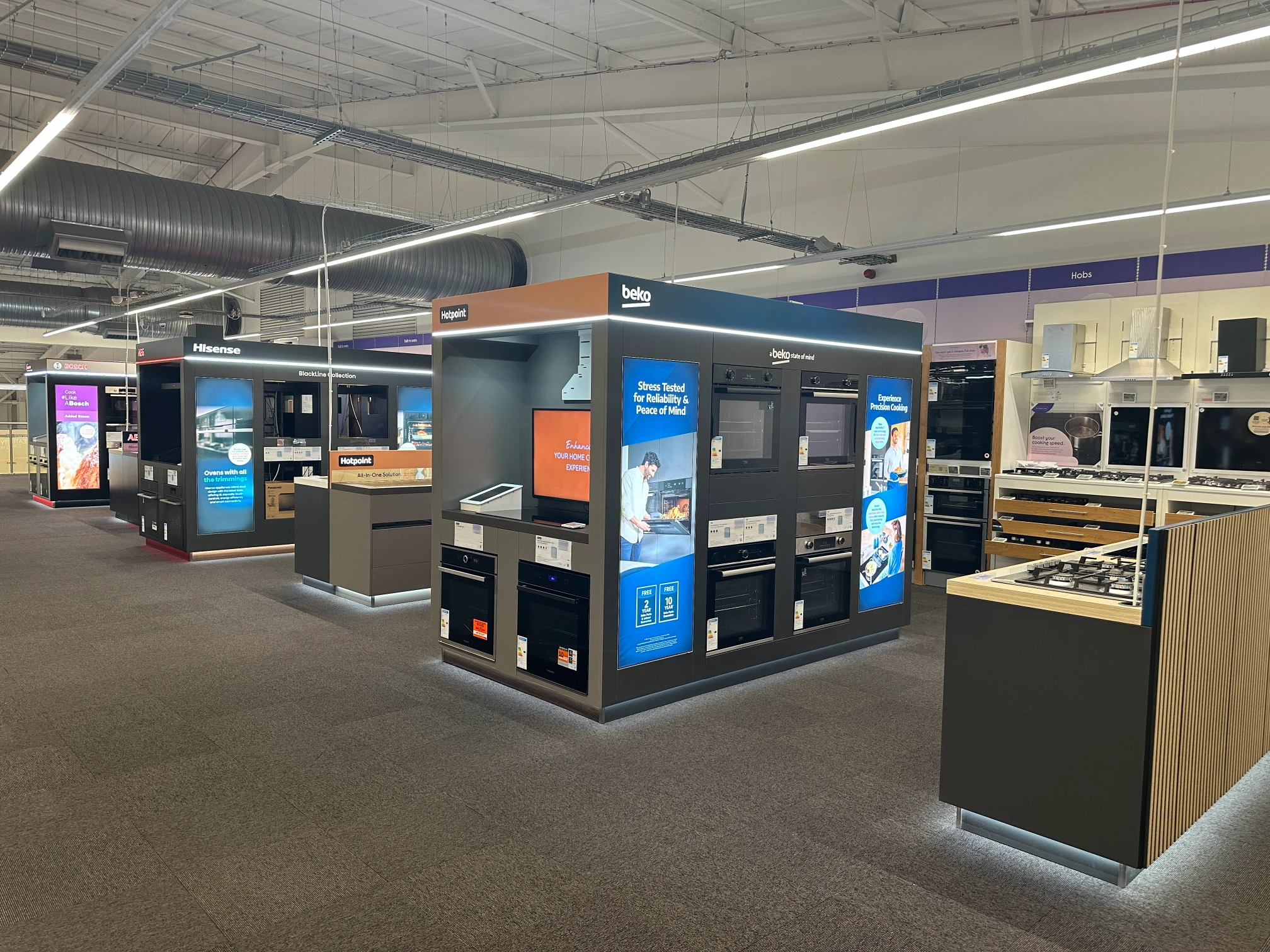
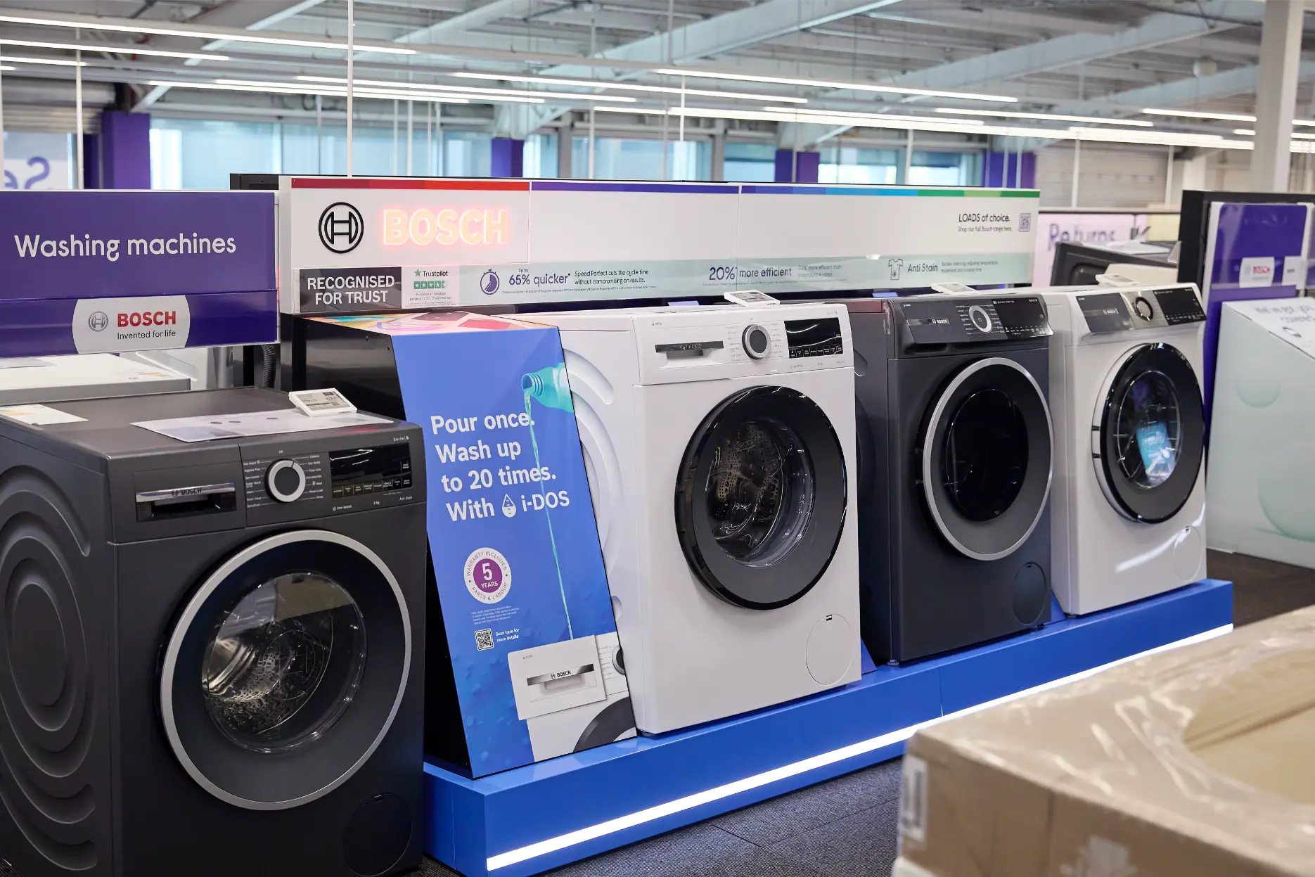
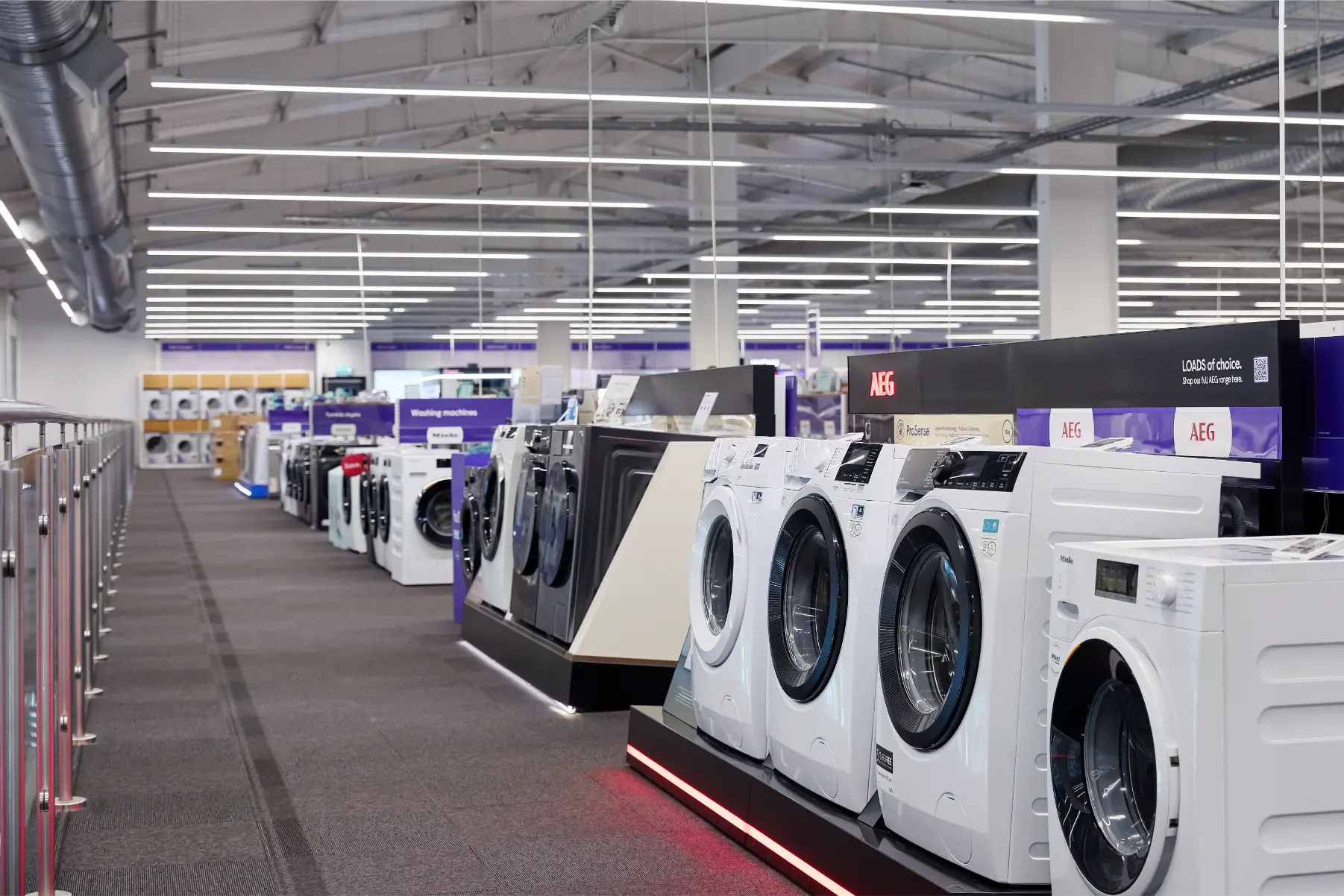
We re‑designed the laundry aisle as a guided, self‑assisted shopping experience. Recognising that customers naturally shop by brand, we shifted the journey from price‑first to brand‑first, creating a clearer and more intuitive flow.
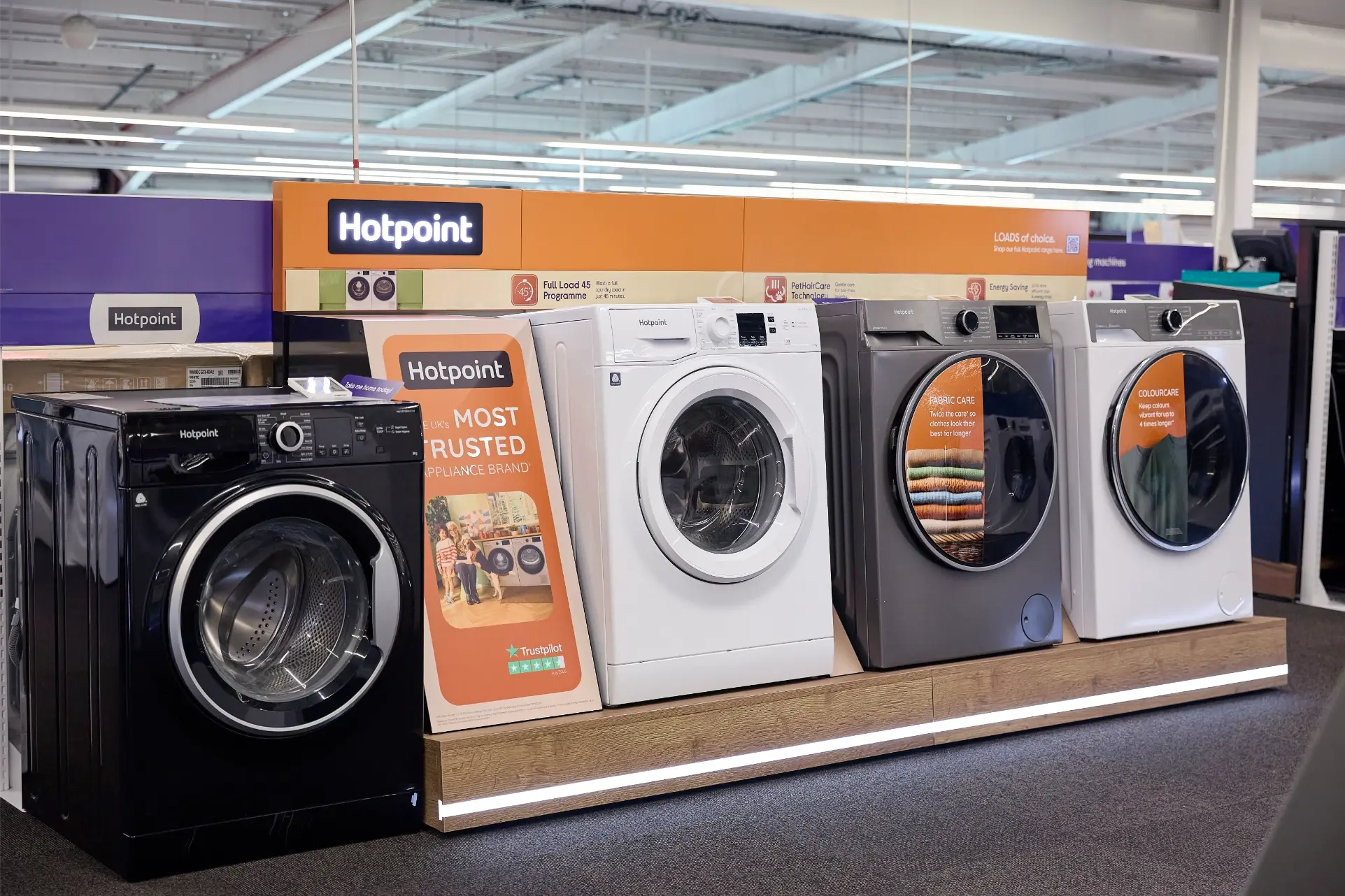
The format centred on a modular display showcasing three machines per brand in a simple “good, better, best” hierarchy. This reduced decision fatigue while still offering meaningful choice. We developed a consistent visual identity that respected each brand’s guidelines, ensuring cohesion across seven participating brands.
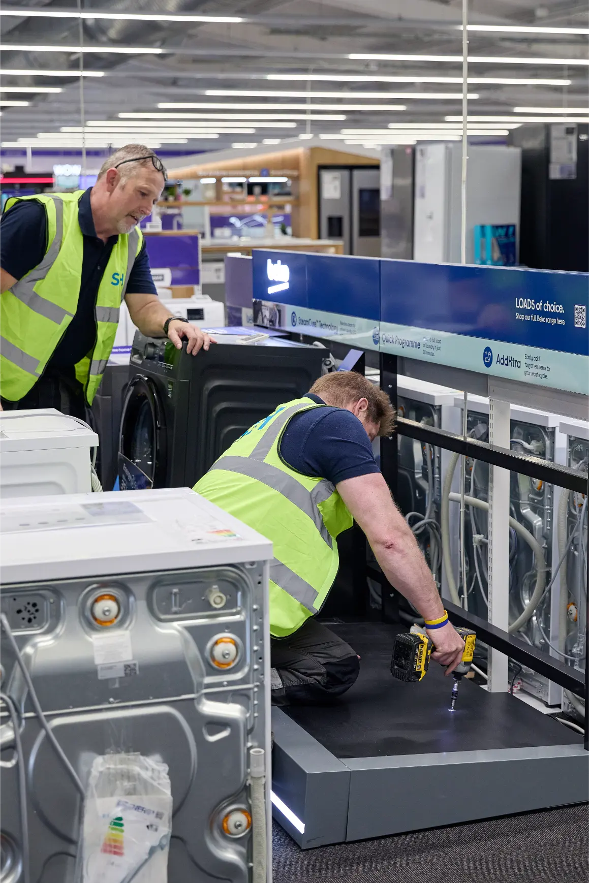
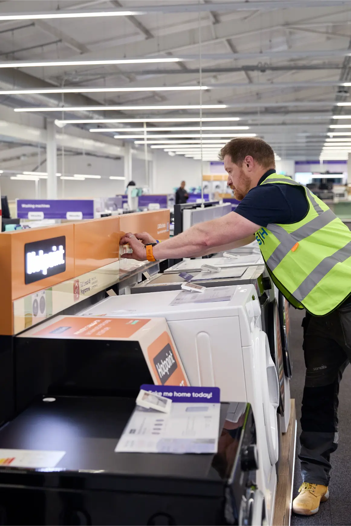
To support product understanding, we introduced benefit‑led messaging and optional digital touchpoints. The engineering balanced the need for heavy‑duty appliance support with a lightweight structure suitable for mezzanine floors and varied store environments.
Delivery
The Solution
Clear Product Hierarchy:
A simple “good, better, best” layout helped customers compare models quickly and confidently.
Brand‑Led Merchandising:
Each display followed a consistent structure while allowing individual brands to express their identity clearly.
Feature‑Focused Education:
POS wedges highlighted key benefits such as auto‑dosing, helping customers understand real‑world advantages.
Interactive Touchpoints:
Optional touchscreens provided deeper product information, supporting both self‑service browsing and colleague conversations.
Robust, Retail‑Ready Engineering:
The system combined heavy‑duty load capacity with a lightweight, modular structure suitable for a wide range of store formats.
The Outcome
The showcase created a clearer, more engaging customer journey that improved product understanding and delivered measurable commercial uplift across the estate.
If you are planning a retail transformation or need technical expertise to bring a complex in‑store concept to life, we would love to hear from you.